Case Study: European Commission - Agora

What’s Agora?
Agora is a platform that allows European delegates to create official documents (text laws, Eu commission guidelines, etc.) to exchange with other delegates and official from Eu members as well. The tool helps them to prepare for upcoming meetings.
Also to search old documents for revisions.
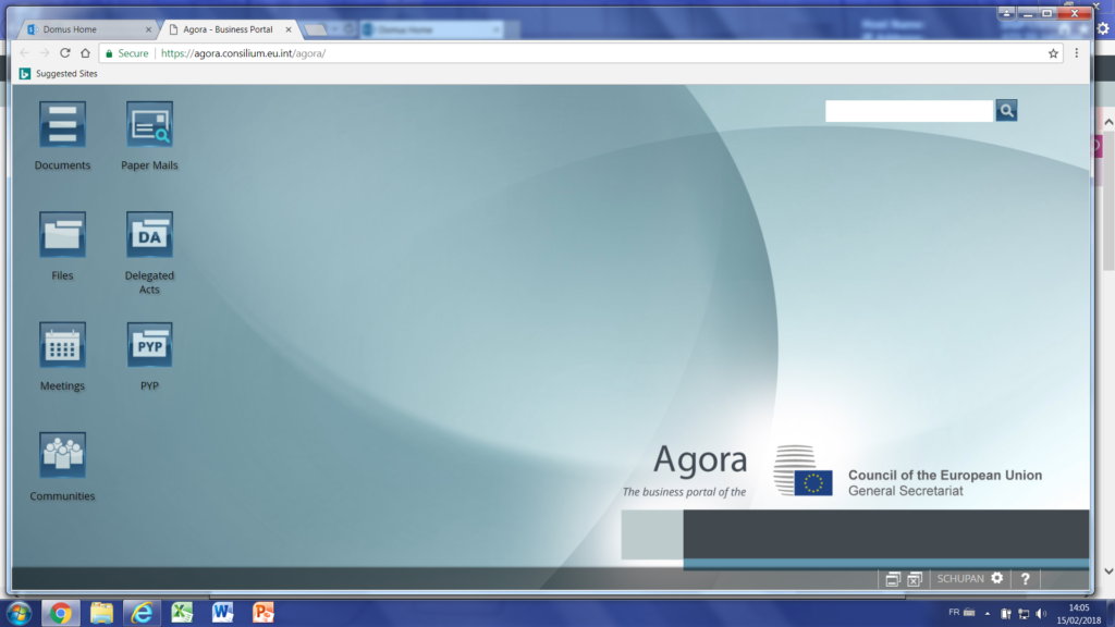
WorkFlow ? compared to a classic app, this workflow is quiet complex because the European official jobs are complex. So a bad UX can make a quiet complex job a mess of complexity.
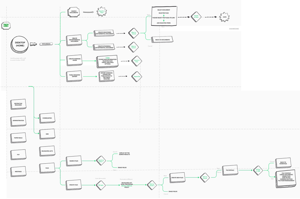
What was the situation ?
Worked in team (UI, UX, business analyst) to propose a POC (proof of concept) the first idea was to merge a unify design with the CRM Salesforce.
The goal was first to collect a maximum of data (focus group, UEQ – User Experience Questionnaire, idea shorting, creation of persona).
I realized that the most important pain point was a system with cascading windows.
The current system allows users to expand, reduce, open and close cascading windows. In some case it can be useful like in any OS but this wasn’t compliant to any modern standard guidelines. If wanted to migrate that design to an app or responsive design it wouldn’t be possible.
A major pain point was that there was not progressive disclosure. So it makes UX slow and brain power consuming.
Recommended solutions ?
It seemed essential to back to simplicity (see Occam’s razor).
With a dashboard more personalized (progressive disclosure) for each profile and less steps, less windows, less scrolling in long searches results looking for ” the right information” in a chaos non relevant informations. Make the user journey and must of tasks flows simpler and more consistent.
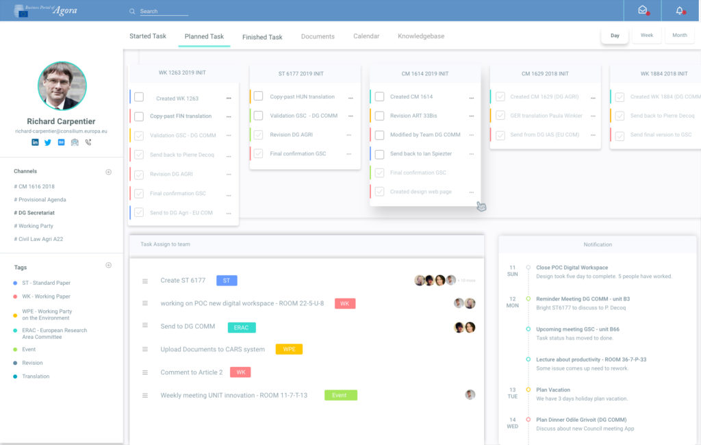
I used Sketch (+ Invision for collaboration between designers and Zeplin plugins for Integration) . I also try Adobe Xd which catch up it late on Sketch plugins ecosystem. The system was quite complex (see upper workflow) so we has still to show lot of informations.
The new interfaces therefore focus on the profile with customizable user interface and metadata . Using persuasive and gamification technics with color , icons and social networks. A kanban board with collaboration features allows the product to make more social interactions.
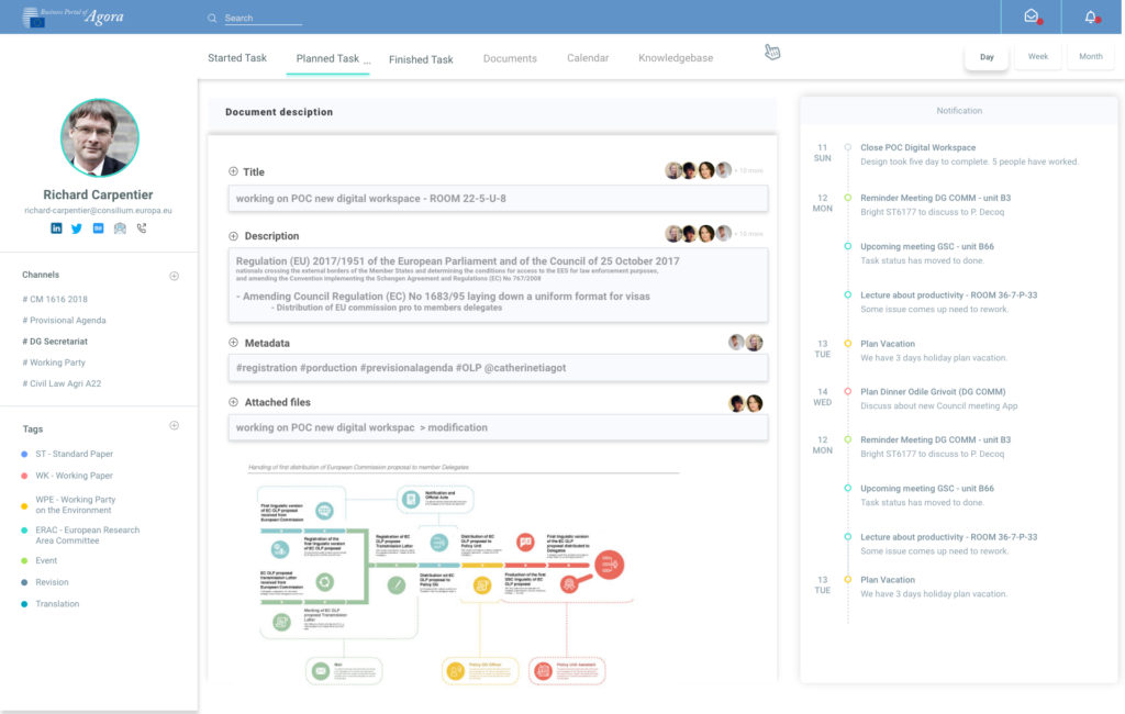
I quickly realized that the old version of Agora did not allow access on mobile and a significant amount of information would have been relevant to allow mobile access. I figure it out that the responsive design platform wouldn’t be enough.
In parallel to the Plateform redesign. I convinced the management (whose are nice managers) to take decission to develop an app.
I could not put everything in the application but simply something which can manages the meetings, that allow delegates to move in the building ( give access to plans) , to find their documents related to each meeting and who will join the meeting.
UI Tools: Balsamic and Figma
What was the purpose of creating a meeting app ?
Facilitate access to meetings, preparation and exchange before it.
This function should also be available on the Agora plateform because the European Council has an extrem diversity of profiles (younger to older) and all are not familiar with apps use as for business purposes.
Other BtoB Case Study
Case Study: Infrabel BtoE

Brief Description:
Infrabel is a Belgian government-owned public company. It focuses on building, maintaining and upgrading the Belgian railway network making its capacity available to railway companies.
The Problem (UX Scenario)
The current pain points that Infrabel is experiencing would be it’s employee and manager want to place assets order in a it application also know as a Ticketing Management System.
There was too much clicking between screens and the overall functionality such as the clear filter on search in web and mobile versions didn’t look too good. Also, there was just too much information on site that needed to be simplified in a way that it would allow users to comprehend the information instead of causing information overload
The Solution (UX Goals)
The goal was to give users the ability to comprehend the information and at the same time to be able to increase their productivity with an ease of use in the UI functionality. I want them to easily find what they’re searching for together with performing their daily tasks and routine easily. My aim is to make it as clear as possible with progressive disclosure.
UX Objectives
The objective is to redesign the web app by adding a gamified functionality where in it would be easier for users to track their activity progress on the application. At the same time we aim to reduce the clutter by simplifying the necessary input fields and displaying information that’s provided on the previous website.
My Design Process
1. User Research
– Identify the problem
– Identify the solution
– Define the objectives
– Sector Competitor Analysis (moodboarding)2. Define
– User personas
The User Research Phase
The Define Phase
I. User Personas
I manage to create 2 personas that will represent the goals and the needs of the larger group in the organization.
Two types of user personas that represent each goals of the organization.
The Design Phase
I. Mock-ups
First I made 2 total different version to get a maximum of feedacks.
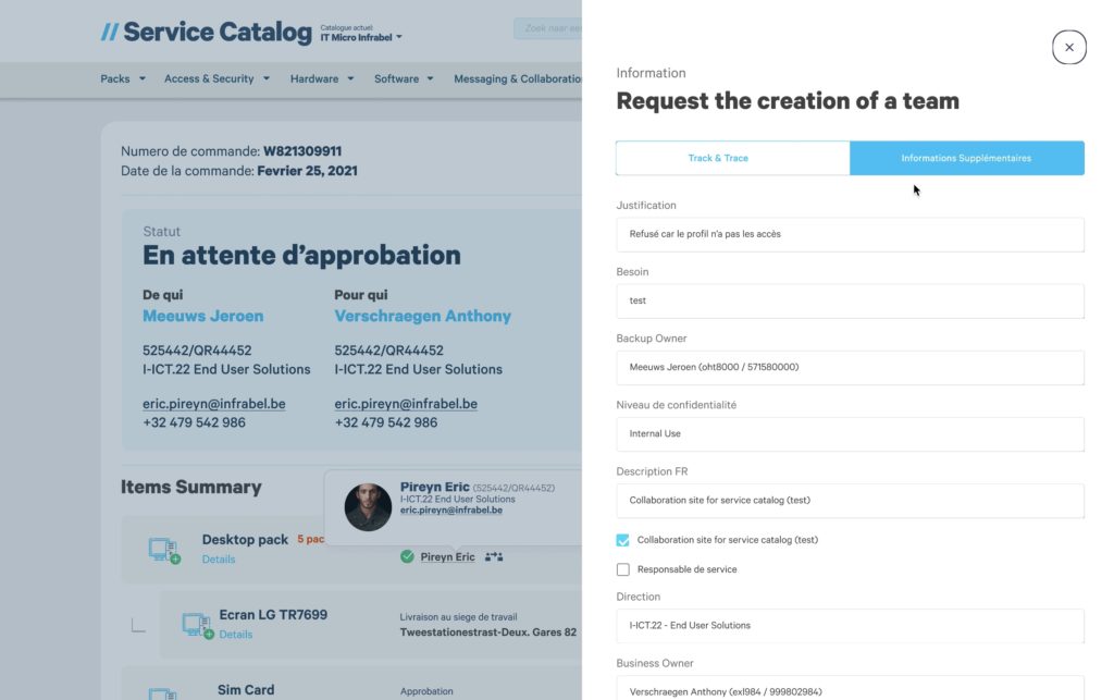

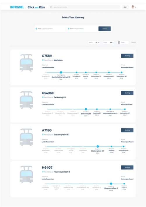
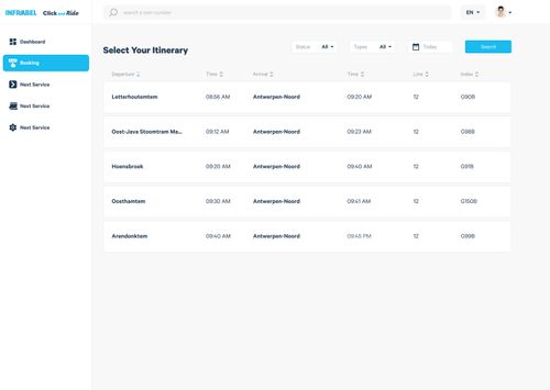
Here are some prototype mock-ups on the redesigned input fields
This is where i also added in the gamified functionality where in it would be easier for users to keep track of their progress and to know the progress of their daily activities.
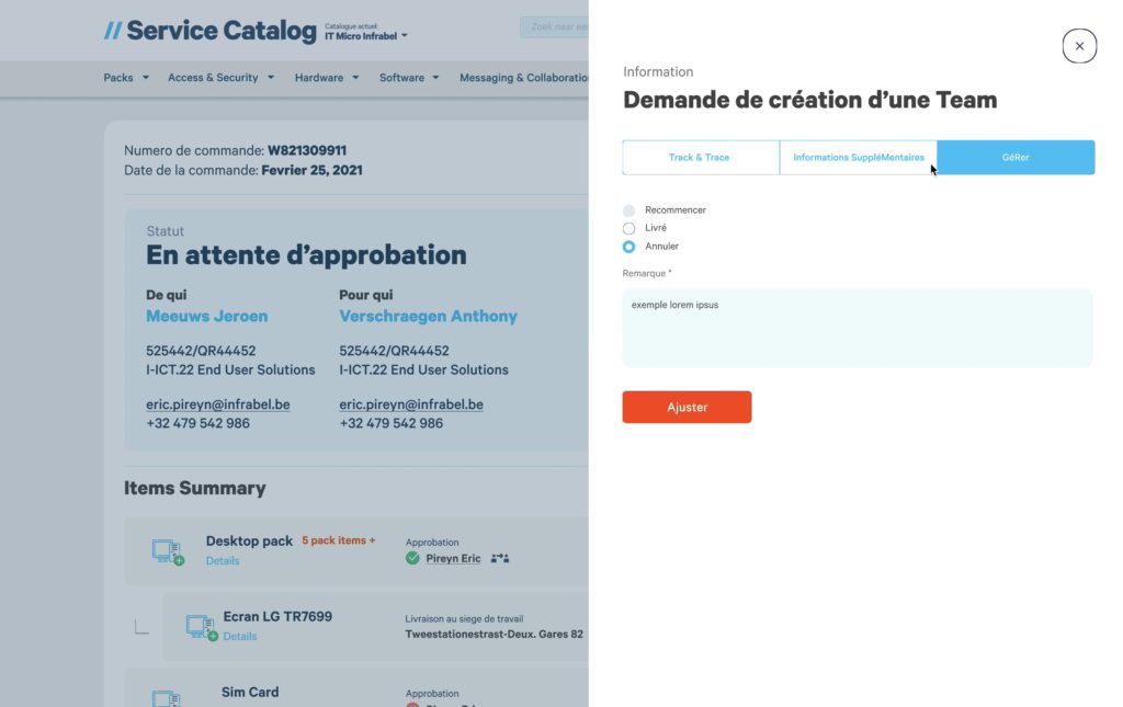
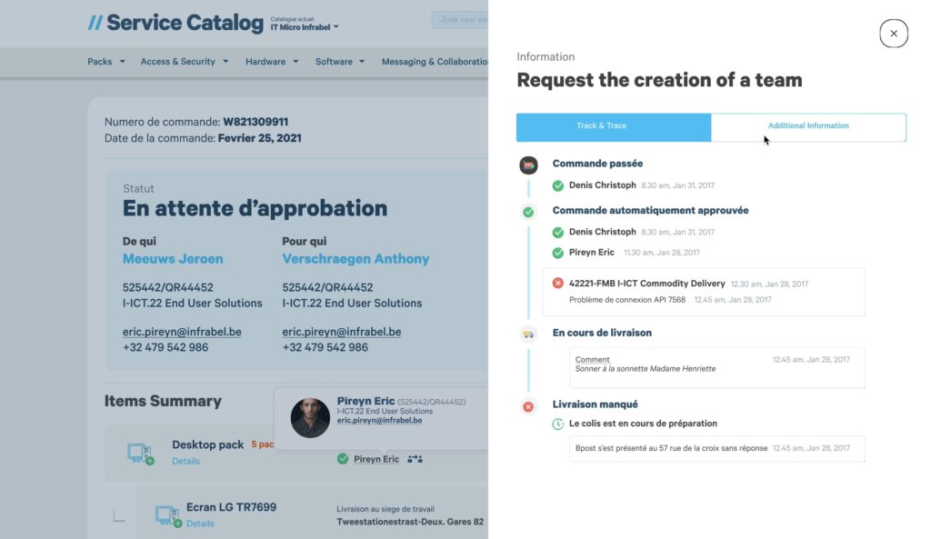
Here are some images of the redesigned application with a gamified functionality
The Conclusion
Having to conduct a series of user interviews from different stakeholders is quite challenging especially when it’s a different industry that’s outside your scope of work. Somehow, it was manageable as the people who were involved were easy to communicate with and collaborating wasn’t a problem.
It was really a nice relief to know that somehow i manage to provide a solution to an ongoing problem in Infrabel. The priority would be the users and users first amongst others. So hopefully, everything would work out well with the new redesigned application (order management) for Infrabel’s employees.
Here the final production version develop in Angular
Case Study: Infrabel Transportation Capability

What is Click and Ride app
Click and Ride is an application for ordering railways in the belgium. can easily order on any platform because this is a web based application. The main objective of this app is that it’s easy to book tram lines on any device. therefore an easy workflow was made from ordering to paying for the selected line, it was also easy to manage the order that had been selected.
The problem
The solution
- He wants to be sure he didn’t make any mistake ordering path and can operate from mobile quickly.
- User wants to book transportation capabilities (path) Paths have different criteria such as time , specification of path which must match with his train requirements.
My Design Process
1. User Research
- Identify the problem
- Identify the solution
- Define the objectives
- Sector Competitor Analysis (moodboarding)
2. Define
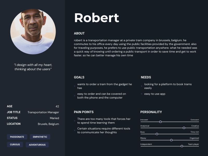
I create a persona to represent user problem and the goals of the larger group in the organization :
Robert – belgian man 42 years old – good salary he is capacity transportation manager at SCNB.
3. The Design Process
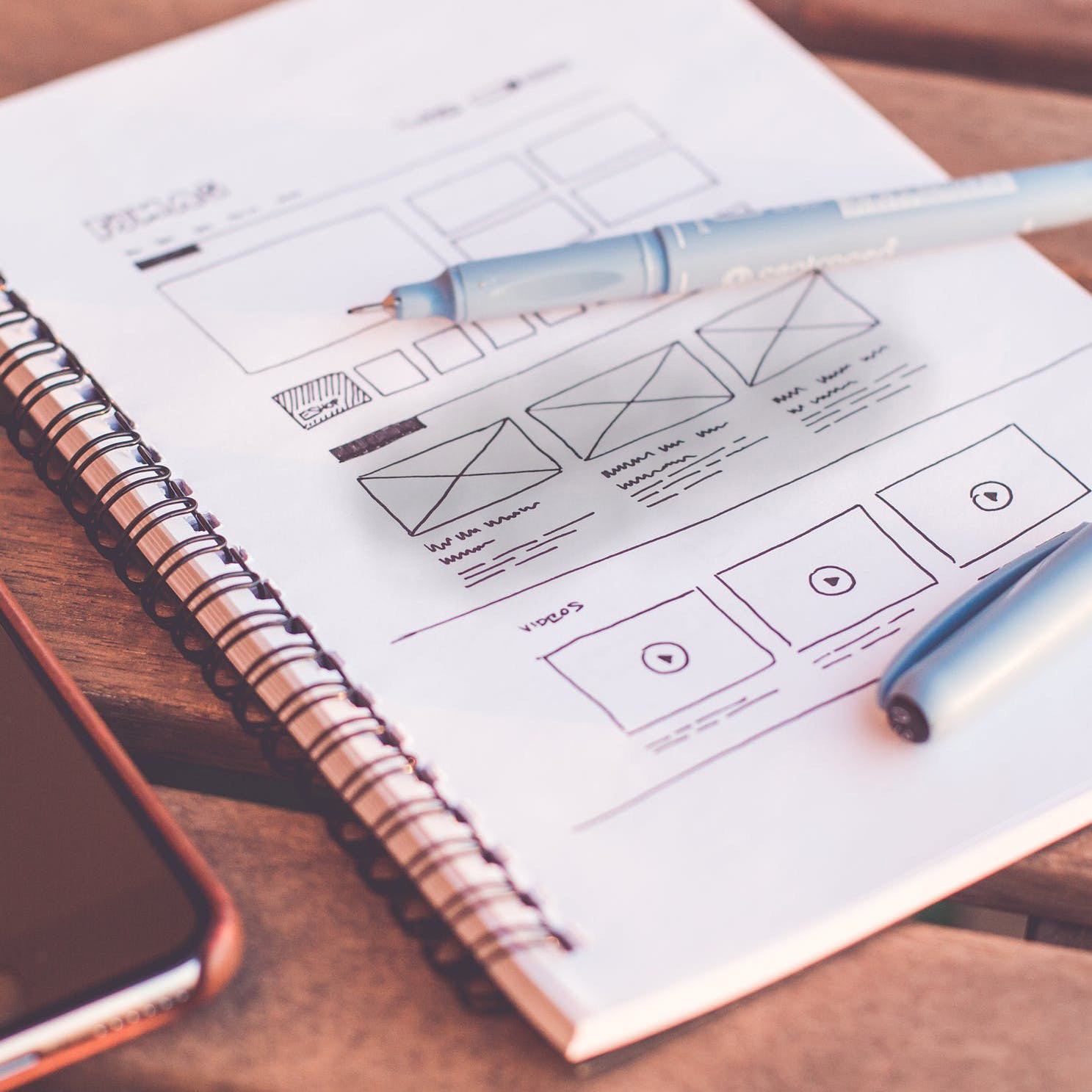
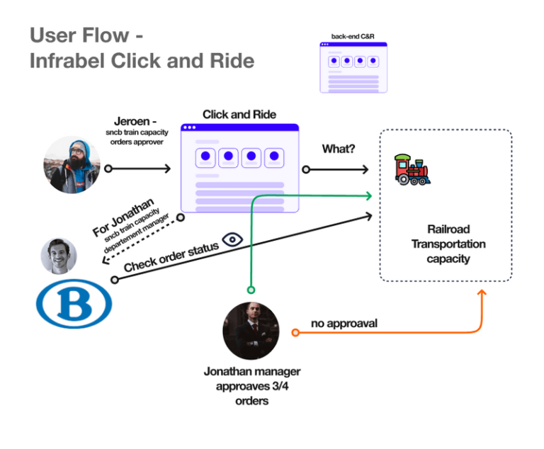
I first mapped the workflow of this application to make it easier to create flow solutions in the application.
Next, i made several versions for the homescreen and then selected by stakeholders to represent the style and appearance that is right for the company’s branding.
Finally, stakeholders opted for a minimalist style with some changes to suit the company’s branding and the features it contains.
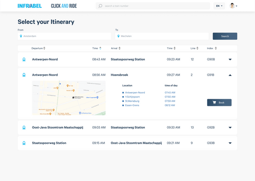
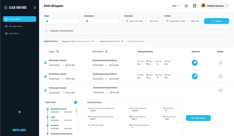
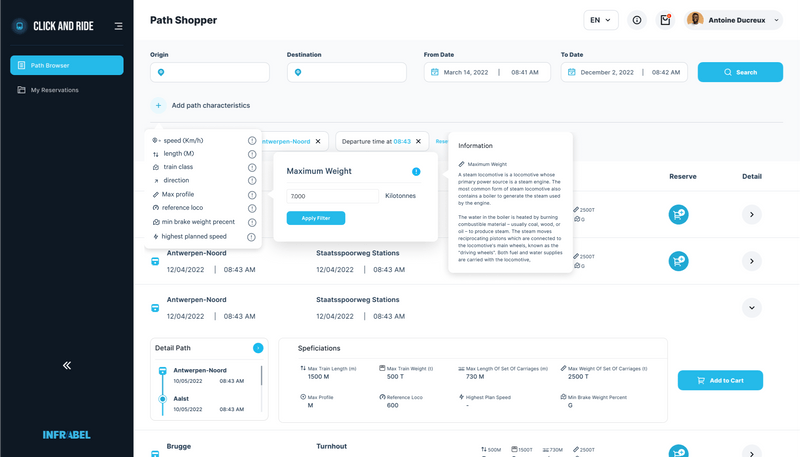
In the path browser page, i can set many options. One of them with a filter. What’s special about the filter is that we can set the tram route for us which may not exist in other applications. So i can choose which path that will take by reserving the path for ourselves.
The process of continuing the order is also made fast and easy with overlays and wizards to prevent page loading again to continue the ordering process.
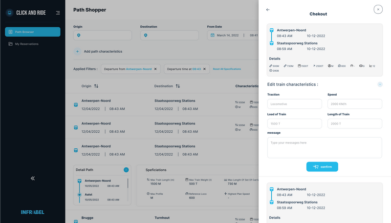
And then, to manage the order i create a new page for it.
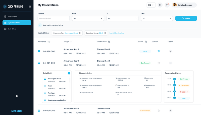
In my order, i can delete and find out which lines have been passed and will be passed also to find out the status of our order tram is ready or there are problems.
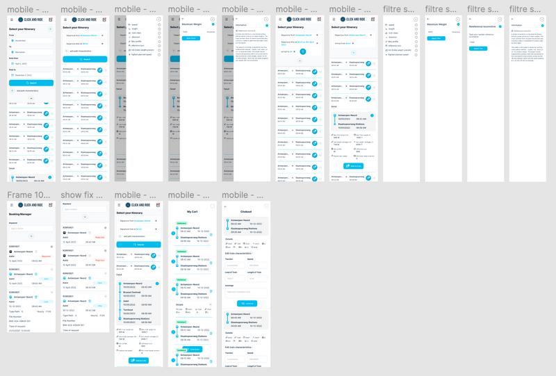
Because this is a booking application that is intended to make it easier for users to book tram lines from anywhere, the mobile version must also be adapted perfectly so that users are comfortable using it.
